Choosing the right colors for your canvas art is all about harmony and emotion. Start by considering your room's color scheme; dominant hues and decor patterns should guide your selection. Think about the feelings you want to evoke—warm colors like red can energize a space, while cool colors like blue promote calm. Complementary colors create exciting contrasts, while analogous colors offer soothing vibes. Don't forget about personal connections; art should reflect your style and memories. By mixing bold and subtle tones, you can create visual balance. Stick around to discover more insights into creating a fascinating atmosphere in your home.
Understanding Color Basics

When you plunge into the world of canvas art, understanding color basics is vital. The color wheel is your best friend, featuring primary colors—red, blue, and yellow—as well as secondary colors like green, orange, and violet. These colors are the foundation for creating striking wall decor art canvas. Knowing how to pair them can transform your space.
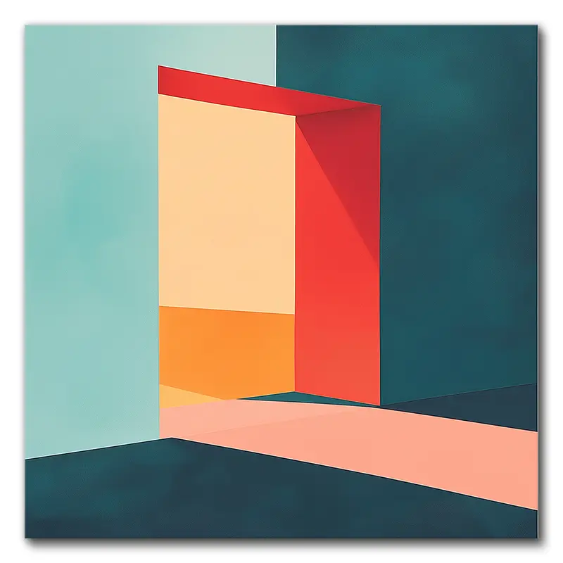
Complementary colors, which sit opposite each other on the wheel, create high contrast and visual interest. For instance, a vibrant orange next to a deep blue can make your modern canvas wall art pop, drawing the eye immediately.
On the other hand, if you prefer a more cohesive look, consider using analogous colors. These are found next to each other on the wheel, like blue, blue-green, and green, producing a soothing effect in your art.
It's also important to acknowledge that colors carry emotional meanings. Red might ignite passion, while blue often evokes calmness. When you choose canvas art color, think about the mood you want to set in the room.
Additionally, understanding color undertones is essential—neutral shades like whites and beiges may seem plain but can carry subtle hues that affect how they interact with your chosen art.
Harmonizing With Home Decor

When you're choosing canvas art, start by evaluating your room's color scheme; this helps guarantee your artwork complements the overall vibe.
Incorporating personal touches, like accent colors from your decor, allows the art to resonate with your style while creating visual harmony.
Assess Room's Color Scheme
A successful canvas art selection starts with a keen evaluation of your room's color scheme.
Begin by identifying the dominant colors, patterns, and themes that already exist in your space. This helps guarantee your art complements the decor rather than clashes with it. Grab a color wheel to explore your options; selecting analogous colors—those next to each other—or complementary colors can create a striking yet harmonious look.
Take a moment to reflect on the textures and shapes present in the room. These elements can greatly influence how your chosen colors interact.
Is your space filled with soft, rounded shapes? Maybe you want to opt for softer, more fluid hues. Conversely, sharp angles might call for bolder colors that pop.
Think about the role of your wall art, too. Do you want it to be a fascinating focal point or a piece that quietly enhances the room's features?
Finally, never underestimate the emotional impact of colors. Different hues evoke different feelings, so choose colors that resonate with the mood you want to create.
Incorporate Personal Touches
Incorporating personal touches into your canvas art selection can enhance your home decor and create a space that truly reflects your personality. Start by evaluating the dominant colors and themes in your existing decor. Choose canvas art that seamlessly blends or contrasts with these elements, helping to create a unified aesthetic.
Don't shy away from selecting art that showcases colors reminiscent of cherished memories or experiences. This approach fosters emotional connections, making your space feel more personal and inviting.
Additionally, consider using accent colors from your artwork to tie together various elements in the room, enhancing the overall design narrative.
Think about how the textures and shapes in your art can mirror those found in your home decor. This helps harmonize the overall look, giving your space an intentional, curated feel.
Finally, experiment with both old and new art pieces. This mix can introduce visual interest and depth, allowing your personal expression to shine while maintaining balance with your existing decor.
Personalization and Sentimentality

Choosing canvas art that reflects your personal experiences and emotions can transform your space into a meaningful sanctuary. When you curate artwork that resonates with your cherished memories, it not only beautifies your home but also evokes deep emotional connections. Personal photos and custom digital art are excellent choices, as they can bring back fond moments and make your living space uniquely yours.
Think about the colors you choose, too. Different hues can resonate with specific memories, enhancing that emotional bond you have with the artwork. For instance, warm colors might remind you of a joyful summer afternoon, while cooler tones could evoke a serene winter evening. These meaningful colors serve as visual reminders of loved ones or significant life events, enriching your home's overall ambiance.
When selecting canvas art, consider how the colors and subjects reflect your personal stories. Each piece can be a true expression of your individuality. Instead of generic prints, opt for art that tells your story—something that makes you smile or evokes a sense of nostalgia. This personalization not only transforms your space but also creates an emotional backdrop that enhances your living experience.
As you choose your canvas art, remember that it's about more than aesthetics; it's about creating a sanctuary filled with memories and emotions that resonate with who you are. So, immerse yourself in your collection of meaningful colors and subjects, and let your walls tell your story.
Reflecting Your Style

Finding canvas art that truly reflects your style involves a deep understanding of the colors and themes that resonate with you. The right selection can transform your space into a personal sanctuary, making it feel authentically yours.
To help you navigate this vibrant world of color, consider these key points:
- Emotional Resonance: Identify colors that evoke specific feelings or memories. This emotional connection can guide your choices and make your space more inviting.
- Experiment with Color: Don't shy away from mixing bold contrasts or harmonious colors. Exploring various combinations can uncover unique palettes that enhance your overall aesthetic.
- Incorporate Accent Colors: Use colors from your artwork as accent shades in your decor. This creates a cohesive look that ties the room together, showcasing your personal taste effectively.
- Mix Old and New: Combining vintage and contemporary pieces can add depth and character. This eclectic approach not only reflects your evolving style but also tells a story about your journey.
Creating Visual Balance

Achieving visual balance in your canvas art is vital for creating a cohesive and inviting space. To start, think about how colors in your artwork interact with the existing decor. You want to guarantee that the colors either complement or contrast effectively, creating a harmonious composition that feels intentional rather than chaotic.
Size and proportion play a significant role as well. A large canvas can dominate a room, while smaller pieces might struggle to make an impact. To avoid your smaller artworks getting lost, consider pairing them with complementary elements, like frames or nearby decor, to create a balanced visual grouping.
Mixing colors of varying intensities can also help. By introducing different shades, you establish focal points without overwhelming the viewer. This layered approach invites the eye to explore the artwork naturally.
Placement is another key factor. Position your canvas art to align with the room's color scheme and overall theme. For instance, if your living room features warm tones, select artwork that incorporates those hues, guaranteeing that it feels like a natural extension of your space.
Using a combination of analogous and complementary colors can further enhance visual balance. Analogous colors are next to each other on the color wheel and create a sense of harmony, while complementary colors, which are opposite each other, add an exciting contrast. Together, they create an engaging visual experience that draws attention and encourages movement across the artwork.
The Power of Accent Colors

Accent colors can truly enhance your canvas art by increasing visual interest and creating striking focal points.
When you strategically incorporate these shades, you not only add depth and dimension to your artwork but also transform the entire atmosphere of the space.
Enhancing Visual Interest
How can the right use of accent colors enhance your canvas art and transform your space? Accent colors possess a unique power to boost the overall aesthetic of your room, adding a layer of visual intrigue that captivates the eye.
Here are some ways to harness that power:
- Contrast and Depth: Strategically placing contrasting colors within your artwork can create a sense of depth, making your pieces more dynamic and engaging.
- Harmonization: Using accent colors that complement your existing decor ties various elements together, ensuring a cohesive look throughout your space.
- Vibrant Energy: Incorporating bursts of vibrant accent colors can breathe life into neutral areas, turning them into inviting and lively environments.
- Subtle Complexity: Even subtle hints of accent colors can enhance your art arrangement, offering layers of visual complexity that intrigue viewers without overwhelming them.
Creating Focal Points
Drawing attention to key elements in your canvas art is essential for creating striking focal points that improve the overall aesthetic of your space. Accent colors play a critical role in this process. By using contrasting accent colors alongside dominant tones, you can dramatically raise your artwork. This approach makes your canvas art stand out against the surrounding decor.
Strategically placing accent colors can also tie together other elements in the room, creating a cohesive and harmonious design. To illustrate this idea, consider the following table that outlines color pairings and their effects:
| Accent Color | Effect on Canvas Art |
|---|---|
| Bright Red | Instantly draws attention |
| Deep Blue | Adds a calming contrast |
| Vibrant Yellow | Infuses energy and warmth |
| Soft Green | Introduces freshness and life |
| Rich Purple | Creates a sense of luxury |
Incorporating vibrant accent colors can breathe life into a room, making it feel more dynamic and inviting. Use these colors thoughtfully to guarantee they complement rather than overwhelm your existing color palette. This balance helps your canvas art feel integrated and purposeful, improving the overall vibe of your space.
Adding Depth and Dimension
Colors play an essential role in adding depth and dimension to your canvas art, transforming a flat surface into an enchanting experience.
By incorporating accent colors, you can create a visual journey that captivates viewers and improves your space. Here's how:
- Striking Focal Points: Accent colors draw the viewer's eye, creating areas of interest that make your artwork memorable.
- Dynamic Engagement: Well-placed accents can add a sense of movement, making your piece appear more alive and interactive.
- Visual Contrast: Using contrasting accent colors alongside dominant hues not only enhances visual interest but also guarantees your art stands out against the wall.
- Cohesive Harmony: Strategic accent colors can tie together various elements in a room, unifying your decor and improving the overall aesthetic.
Seeking Professional Guidance
When you're ready to improve your canvas art, seeking professional guidance can make a significant difference. Professional design teams specialize in providing tailored advice on color selection, guaranteeing your canvas art harmonizes with your existing decor. This thoughtful integration not only enhances your space but also creates a visually appealing environment.
Consulting with experts can help you identify the emotional resonance of colors. They can guide you in choosing art that truly reflects your personal connections and sentiments, making your space feel more like home. With insights into color theory, professionals can recommend complementary and analogous color schemes, creating balance and harmony within your room. This expertise can transform an ordinary space into an inviting one.
Additionally, seeking professional help alleviates decorating fatigue. Rather than feeling overwhelmed by choices, you can make informed decisions early in the design process. This guarantees that art seamlessly fits into your overall decor, saving you time and energy.
Collaborating with professionals allows you to turn your color preferences and art selections into a cohesive look, enhancing the overall aesthetic of your living space. In the end, professional guidance is about more than just colors; it's about creating a unified design that resonates with you.
Emotional Impact of Art

Art holds the power to evoke profound emotions, influencing how you feel in a space. The colors, themes, and styles you choose for your canvas art can greatly shape your mood and the atmosphere of your home. Here are a few ways art can impact your emotions:
- Mood Enhancement: Studies show that viewing aesthetically pleasing art can trigger endorphin release, boosting your mood and creating feelings of pleasure.
- Color Influence: Warm colors like red and yellow can ignite excitement and energy, while cool colors such as blue and green promote calmness and relaxation.
- Personal Connections: Certain artworks may resonate with you on a personal level, becoming cherished reminders of loved ones or meaningful moments, deepening their emotional impact.
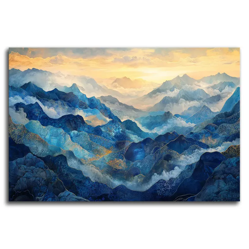
- Atmospheric Change: The type of art you hang can transform the perceived atmosphere of a room; serene landscapes can create tranquility, whereas vibrant abstracts can energize the space.
Understanding the emotional impact of art helps you make informed choices when selecting pieces for your home.
Keep in mind that your unique experiences and cultural background shape your reactions to art, making this a highly subjective experience.
By choosing art that aligns with your feelings and the desired atmosphere, you can create a space that not only reflects your personality but also nurtures your emotional well-being.
Recommended Wall Colors

Choosing the right wall colors can greatly enhance the overall feel of your space and complement your canvas art. When selecting colors, consider the specific room and its purpose.
For living rooms, neutral tones like beige and gray provide versatile backdrops that allow your art to shine. If you're aiming for a relaxing atmosphere, soft blues and greens work wonders, creating a welcoming vibe.
In bedrooms, you'll want to prioritize tranquility. Soft pastels, such as lavender and pale pink, can foster a calm environment, perfect for winding down. On the other hand, if intimacy is what you seek, deeper shades like navy and deep green can create a cozy sanctuary.
Kitchens are often lively spaces, so think about using bright colors like yellow and orange to stimulate appetite and energy. Alternatively, soft whites and creams guarantee a fresh, clean look, making the area inviting for cooking and gathering.
For home offices, consider vibrant tones like red and orange to energize your workspace, helping you tackle tasks with enthusiasm. If focus is your goal, cool colors like blue and green promote calmness, enhancing productivity.
Don't forget about accent colors! They can highlight specific art pieces and add visual interest, guaranteeing that your wall colors harmonize beautifully with your overall decor theme.
With thoughtful choices, you can create an environment that not only showcases your art but also enriches your daily life.
Practical Tips for Art Selection

For a successful art selection process, it's essential to take into account the existing color palette of your room. By choosing canvas art that either complements or contrasts with your decor, you can create visual harmony that enhances your space.
Here are some practical tips to guide you:
- Use Color Schemer Tools: These handy tools help you visualize how potential artwork will interact with your wall colors. It's like trying on clothes before you buy them—only for your walls!
- Select a Minor Color: Choose a subtle hue from the artwork to inspire your wall color. This guarantees the art takes center stage while maintaining a cohesive look throughout the room.
- Incorporate Gradients: Opt for canvas art featuring gradients that provide a variety of hues. This flexibility allows the piece to match with different wall colors, making it versatile for any room setting.
- Assess Emotional Impact: Consider how colors affect mood. Warmer tones can energize a space, while cooler tones promote calmness and relaxation. Choose art that resonates with the atmosphere you want to create.
Final Thoughts
Choosing the right colors for your canvas art is like picking the perfect ingredients for a recipe; everything needs to blend harmoniously. By understanding color theory and considering your decor, you can create a space that feels uniquely yours. Don't shy away from personal touches, as they can add depth and character to your home. Remember, art isn't just decoration; it's an expression of who you are. So, take your time and enjoy the process of curating your visual story. At VerVeLush, we specialize in exquisite canvas prints that not only enhance your decor but also reflect your unique style. Explore our collection and let us help you find the perfect pieces that resonate with your artistic vision.

 today and enjoy free shipping!")